Android 17’s Emoji Redesign Leaves the Blobs Behind
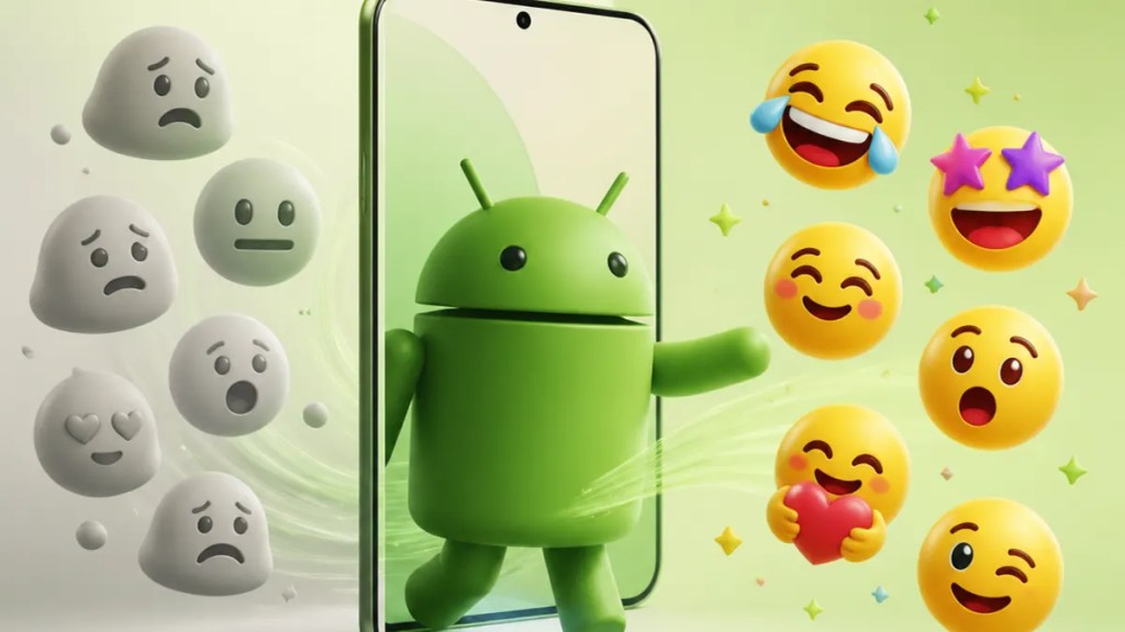
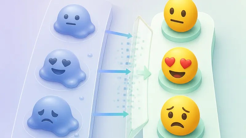
If you’ve been quietly hoping Google might someday bring back Android’s old blob emoji, this update is probably the clearest sign that it’s not happening. The Android 17 emoji redesign appears to push Google’s emoji style even farther away from that older look, with updated faces and symbols shown in early reporting from 9to5Google.
That may sound minor, but emoji are one of those design details you see every day. If you use Android, this is the kind of visual change that can make your phone feel subtly newer—or just different—in messages, reactions, and menus.
Quick Summary
Google is reportedly updating emoji again in Android 17.
The big takeaway: the redesign moves further away from the old “blob” era rather than revisiting it. Based on 9to5Google’s report, the refreshed set includes redesigned faces and symbols, which suggests Google is continuing to refine its current visual language instead of reviving its most distinctive past style.
For most people, this means your emoji may look a bit different after an Android emoji update, even if the meaning stays the same.
What’s changing in the Android 17 emoji redesign
The clearest reported detail so far is direction. According to 9to5Google, Android 17 is getting redesigned emoji that move “even further” from the blobs. In plain English, Google emoji are not circling back to the rounded, jellybean-like characters that once made Android instantly recognizable.
Instead, the Google emoji redesign seems to continue the company’s more modern style. The source points to updated faces and symbols, and the gallery attached to that report shows that this is not just a tiny polish pass. It looks more like a broader visual refresh.
That matters because emoji are part of a platform’s personality. You may not think about them much until one smiley face suddenly looks unfamiliar in your favorite chat app.
Why the blobs still matter to people
If you’ve used Android for a long time, you probably remember the blobs. They were unusual, playful, and very obviously Google’s. They also divided opinion: some people loved the charm, others thought they looked odd next to emoji on iPhone or other platforms.
What this Android 17 change seems to say is that Google has fully moved on. The company isn’t just keeping the post-blob style alive; it’s reportedly refining it further. So if you were waiting for an “Android 17 blobs” comeback, this update points the other way.
That’s interesting beyond nostalgia. Emoji design is one of the easiest ways to see how a company wants its software to feel. A more standardized look can make Android feel more visually in step with the wider emoji world, even if it loses some of the weirdness longtime fans remember fondly.
What users should actually expect
For everyday users, the impact is mostly visual.
Your messages should still read the same way, but some expressions may feel slightly different because emoji design affects tone more than people realize. A grin that looks playful in one style can look awkward or more neutral in another. That’s true across platforms, and it’s part of why every Android emoji update gets attention out of proportion to its size.
There’s also the practical side: if you send emoji across apps and devices, what you see on Android is not always exactly what someone else sees on an iPhone or inside a specific messaging app. Emoji rendering—the way software draws the same character in its own style—varies by platform. So Google changing its own artwork won’t erase those differences, but it may change how Android users experience them.
Why this redesign feels final for the blob era
Google has changed emoji before, so one redesign alone would not necessarily mean much. But the framing in 9to5Google’s coverage makes this update stand out: Android 17 is reportedly moving further from the blob look, not merely maintaining distance from it.
That’s why this feels less like a routine cleanup and more like a statement about Google emoji style. The company appears committed to evolving the version of Android emoji people know today, not reviving the version many still associate with older Android phones.
In other words, the blobs now look more like a closed chapter than a style waiting for a comeback.
Should you care?
Probably a little.
This isn’t the most important Android 17 feature, but it’s one of the most visible. You’ll notice emoji in texting, social posts, notifications, and system interfaces without trying. And if you care about platform identity, this emoji redesign gallery is a small but telling clue about where Google’s design taste is heading.
For casual users, the change is simple: Android may look a bit fresher. For enthusiasts, it’s another sign that Google wants consistency more than nostalgia.
FAQs
Is Google bringing back the old Android blob emoji in Android 17?
Based on 9to5Google’s reporting, no. The redesign reportedly moves further away from the blob style.
Will the Android 17 emoji redesign change how my messages work?
Probably not in a functional sense. The main change appears to be visual, so your emoji should still mean the same thing, but they may look different on your device.
Why do emoji look different on Android and iPhone anyway?
Because each platform can render, or draw, emoji in its own style. The underlying emoji character may be the same, but Apple, Google, and apps can display it differently.
Internal link suggestions
- A guide to how Android emoji have changed over the years
- Coverage of the latest Android 17 features and design updates
- An explainer on how emoji rendering works across Android, iPhone, and messaging apps
